
Publishing and Design Analysis: High-Quality Visual Presentation Improves Audience Engagement
Visual Quality Shapes the First Impression
Audiences often decide whether content feels credible before reading the opening sentence. The judgement happens fast. A clean layout, sharp imagery and thoughtful spacing signal care, while crowded pages and inconsistent styling create friction. In publishing, that first visual impression can determine whether someone keeps reading or quietly moves on.
This matters across books, magazines, reports, catalogues and digital publications. Strong design doesn’t need to shout. In fact, the most effective work often feels effortless, guiding the eye without making the reader think about grids, margins or typography. That’s the trick. Good design stays visible enough to attract attention, then steps aside so the content can do its job.
Presentation Supports Meaning
Visual presentation isn’t decoration added at the end of a project. It shapes how information is understood. Headings create hierarchy. White space gives ideas room to breathe. Image placement controls pace, while font choices affect tone long before readers consciously notice them.
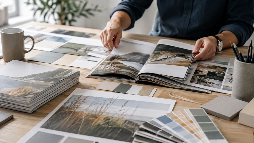
Consider a catalogue featuring prints for sale. If the artwork appears in low-resolution images, sits against distracting backgrounds or carries inconsistent captions, the publication weakens the product. A carefully designed spread does the opposite. It gives each piece context, scale and presence, helping readers picture the work in a home, office or gallery setting.
Readers Notice the Small Things
Anyone who has handled a beautifully produced book knows the feeling. The paper has weight. Images look true to life. Page turns feel natural rather than cramped. These details may seem small, yet together they turn ordinary information into something people want to keep.
Poor execution creates the opposite response. A misaligned heading, stretched photo or dense wall of text can make valuable content feel rushed. One flaw rarely ruins a publication, but repeated distractions chip away at trust. Readers might not explain why the material feels off. They simply stop engaging.
Consistency Builds Recognition
Consistent design also helps publishers and organisations build a recognisable identity. Repeated use of colour, typography, image treatment and layout creates familiarity across editions and campaigns. That recognition matters in crowded markets where audiences scroll past hundreds of visual messages each day.
The goal isn’t rigid sameness. It’s controlled variety. A publication should have enough flexibility to keep each page interesting while retaining a clear visual language. Think of it like a well-run kitchen. Different dishes can leave the pass, but they should still feel as though the same team prepared them.
Print Still Commands Attention
Digital channels offer speed and reach, but physical publishing holds a different kind of power. A printed piece occupies space. It can sit on a desk, travel in a bag or remain on a coffee table for weeks. No battery required, which is still a handy feature.
For businesses using print media Wollongong audiences can hold, revisit and share, production quality becomes part of the message. Stock selection, colour accuracy, binding and finishing all affect perceived value. Cutting corners may reduce the initial bill, yet it can also shorten the life of the piece and weaken its impact.
Design Encourages Deeper Engagement
High-quality presentation makes content easier to approach, understand and remember. It helps readers find key ideas, absorb complex information and spend more time with the material. That is not a cosmetic benefit. It is a practical publishing advantage.
The strongest publications respect both the message and the audience. They use design with purpose, edit without mercy and avoid clutter for clutter’s sake. Pretty alone isn’t enough. Useful, readable and memorable wins. Every single time, too.
Media Contact
Company Name: News Today
Contact Person: Oliver Taylor
Email: Send Email
Country: Australia
Website: https://newstoday.au/


